Etsy mockups matter more than most sellers want to admit. In a lot of niches, the difference between a listing that gets ignored and a listing that earns the click is not the design itself. It is the presentation.
I have watched sellers spend hours obsessing over tags while leading with weak, flat, low-context listing images. That is backwards. If your main image does not stop the scroll, the rest of the listing barely gets a chance.
If you want to know how to make Etsy mockups that actually increase clicks and sales, I want to give you the practical version. Not a fluffy “make it aesthetic” answer. I mean what to show, what to avoid, how to structure your image set, and how to build mockups fast enough to test multiple products without turning your workflow into a bottleneck.
Key Takeaways
- The first Etsy image does the heavy lifting. Your mockup has one job first: earn the click. Conversion comes after that.
- Lifestyle context beats generic prettiness. Buyers click faster when they can instantly understand what the product is for, who it is for, and how it fits into real life.
- Scale and clarity matter. Etsy itself recommends strong listing images, and weak resolution or confusing composition will quietly hurt performance.
- Winning mockups come from systems, not inspiration. The sellers who scale do not hand-build every image from scratch. They create repeatable mockup workflows and test variations quickly.
Table of Contents
- Why Etsy mockups matter more than most sellers think
- What good Etsy mockups actually do
- How to make Etsy mockups that increase clicks
- The best Etsy mockup image sequence for most listings
- The mockup mistakes quietly killing your CTR
- How to scale Etsy mockups without losing quality
- Frequently Asked Questions
Why Etsy mockups matter more than most sellers think
Most Etsy advice over-focuses on SEO. SEO matters. I care about it a lot. But your images are what make that traffic worth anything.
Your title can get you surfaced. Your tags can help relevance. But the mockup is what gets the human to stop, process, and click.
Clicks come before conversion
This sounds obvious, but a lot of sellers miss it: your first mockup is not there to explain everything. It is there to win the click.
That means your hero image should prioritize clarity over completeness. One strong visual angle beats a cluttered collage almost every time in crowded search results.
I have seen plenty of decent designs underperform because the mockup looked like a template. No emotion. No context. No reason to stop scrolling.
What Etsy itself tells you
Etsy’s own image guidelines say your first listing photo should be at least 635px wide and tall to avoid appearing lower in search, and the Seller Handbook repeatedly pushes sellers toward images that help shoppers understand size, use, and context. Etsy also explicitly says lifestyle photos help buyers imagine owning the product. That matters because imagination is what turns curiosity into intent.
If you sell personalized products, Etsy is even stricter. Their policy says your main image cannot be a blank product or a mockup with placeholder text. The platform is telling you, in plain English, that realistic presentation matters.
Useful references here:
- Etsy image requirements and best practices
- Etsy Seller Handbook on product photo types
- Etsy listing image policy
If your listing image looks generic, your CTR usually does too.
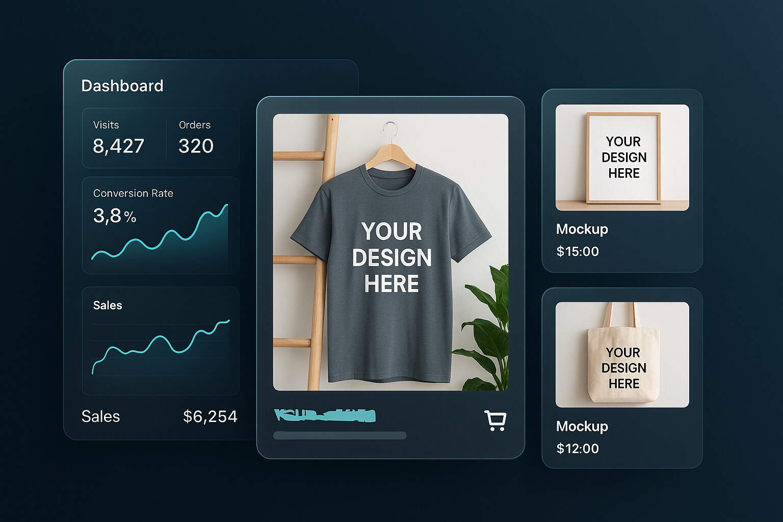
This is exactly why we built Product Mockups into MyDesigns. You can test cleaner scenes, tighter crops, and more conversion-focused variations without rebuilding every image from scratch.
What good Etsy mockups actually do
A good Etsy mockup does not just make your product look nice. It answers questions fast.
Show the use case in one second
The buyer should instantly understand what they are looking at. Is this shirt for a mom gift? A niche hobby shirt? A trendy minimalist digital print? A nursery wall art set? If the mockup makes them work to decode it, you lose speed. And on Etsy, speed matters.
This is why lifestyle context is so powerful. Etsy’s own photography guidance talks about showing the item in its natural habitat and using props to help shoppers understand purpose and scale. Strong mockups compress that understanding into a single glance.
Sell scale, texture, and trust
Mockups also reduce uncertainty. Shoppers want to know:
- How big is this?
- How does it sit on the product?
- How readable is the design?
- What will this feel like in real life?
Baymard has shown how often ecommerce sites still fail basic image resolution and in-scale presentation. That lines up with what I see across Etsy too. Sellers assume buyers will fill in the gaps. They will not. If your images leave room for doubt, doubt usually wins.
Baymard’s research on insufficient image resolution and zoom and their work on in-scale product images are worth reading if you want the UX angle behind this.
How to make Etsy mockups that increase clicks
Here is the part most people actually need. Not theory. The execution checklist.
Start with the thumbnail, not the full image set
Your first image matters disproportionately. So design for search results first.
- Use a composition that still reads at a small size
- Keep the design large enough to understand instantly
- Avoid unnecessary text overlays on the main image
- Use contrast that makes the product pop against Etsy’s interface
- Do not overcrowd the frame with props
If the thumbnail does not stop the scroll, the rest of your nine images do not matter yet.
Pick the right scene for the buyer
I strongly recommend matching the mockup to the buyer’s identity, not just the product category.
A generic desk scene for wall art is fine. A scene that looks like the exact room your buyer wants to create is better. A neutral mug mockup is fine. A mockup that reflects the gifting moment, season, or personality of the buyer is stronger.
This is where niche sellers can quietly win. They do not need a better product. They need a more accurate visual translation of the buyer’s taste.
Make the design instantly legible
One of the easiest ways to ruin a mockup is to choose a scene that competes with the design. Busy backgrounds, poor contrast, weird garment folds, tiny placement, and distracting props can make a solid design look weak.
If you sell apparel, I would rather see a cleaner shirt mockup with obvious readability than an overly styled lifestyle image where the artwork gets lost. Pretty does not always convert.
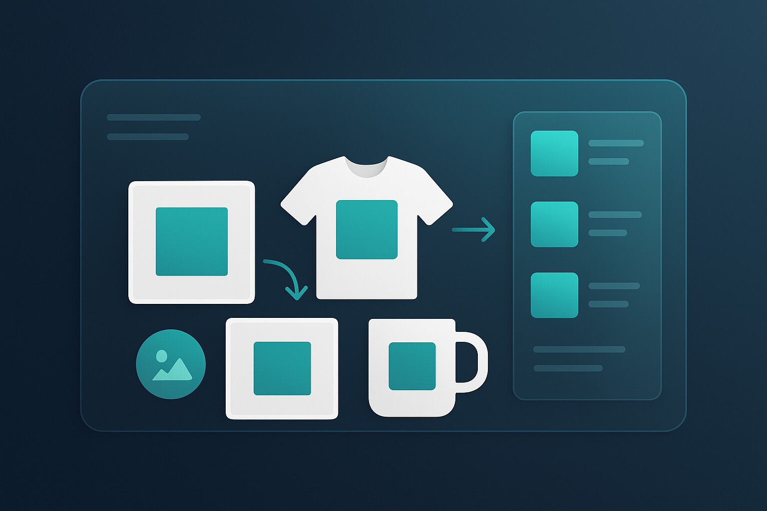
The hard part is not making one good mockup. It is making 25 of them fast.
MyDesigns was built for that exact bottleneck. You can apply designs across products, create multiple visual variations, and keep your listing workflow moving instead of getting stuck in design cleanup mode.
The best Etsy mockup image sequence for most listings
If I were rebuilding an Etsy listing from scratch today, this is the image order I would use most of the time:
| Image Slot | What to Show | Why It Matters |
|---|---|---|
| Image 1 | Best-performing hero mockup | Earns the click in search results |
| Image 2 | Alternate angle or alternate lifestyle scene | Builds confidence and interest |
| Image 3 | Close-up of design detail or texture | Improves trust and perceived quality |
| Image 4 | Scale or fit reference | Reduces uncertainty |
| Image 5 | Feature or sizing information | Answers practical objections |
| Image 6-10 | Color options, personalization examples, social proof style visuals, or gifting context | Supports conversion once the click is won |
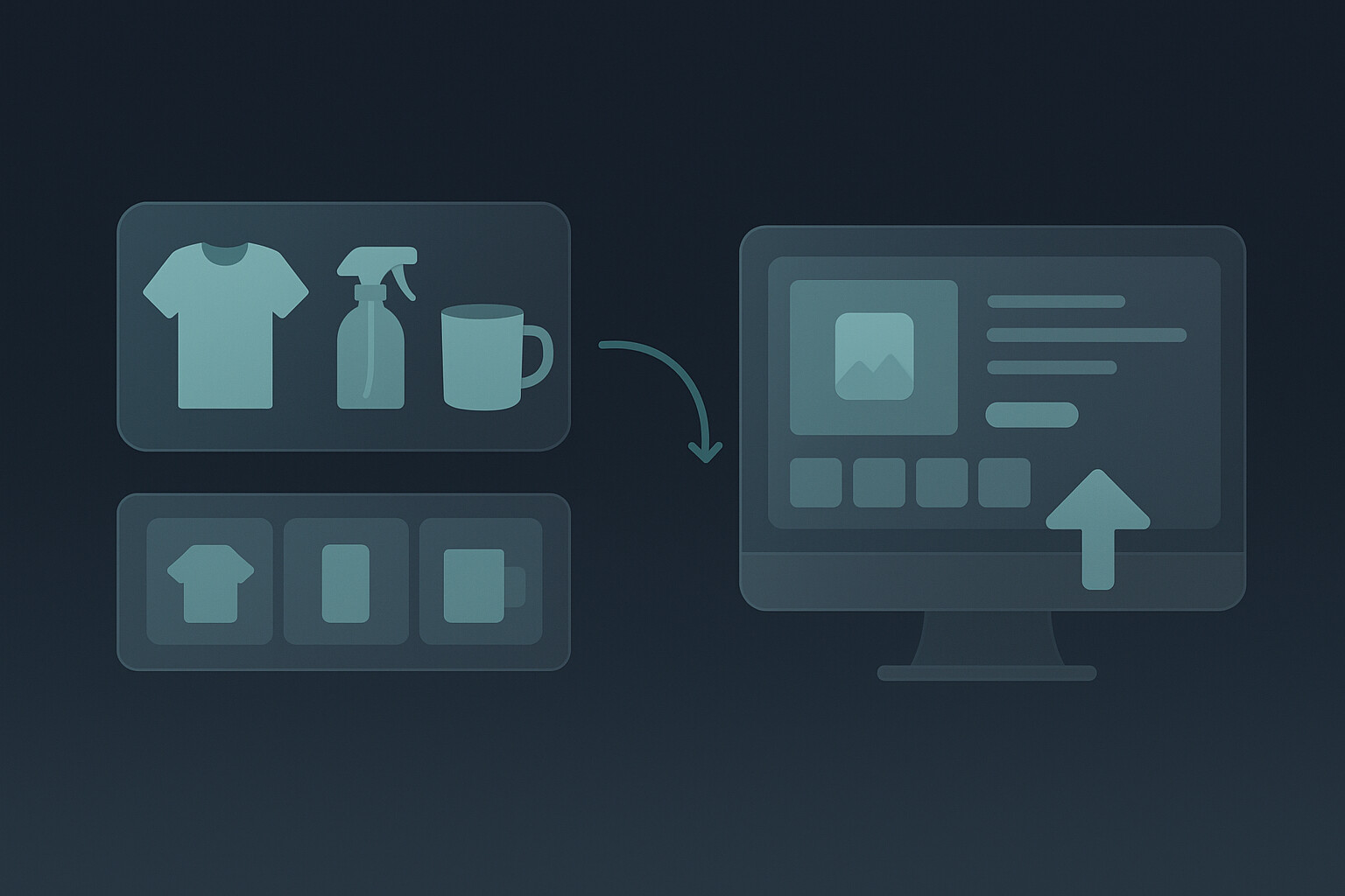
This is also where Listing Management and Vision AI become useful. Better visuals alone are not enough. You want the listing copy and publishing workflow to keep up with the image quality.
If you are still manually rebuilding every listing image set one at a time, you are going to feel friction every time you want to test a new angle. That is exactly why I push sellers toward systems that connect design, mockups, listing creation, and publishing. Our Bulk Publish workflow exists because speed compounds.
A better image should turn into a live listing fast.
Once you have a winning visual angle, the next move is speed. Create your mockups, generate SEO-ready listing copy, and push products live without bouncing between disconnected tools.
The mockup mistakes quietly killing your CTR
Here are the mistakes I see over and over:
- Overdesigned scenes. The mockup looks artistic, but the product message gets buried.
- Tiny design placement. If the actual artwork is too small to read in search, performance usually suffers.
- No scale cues. Buyers cannot tell how large the product is or how it fits in real life.
- Inconsistent visual identity. Every image feels like it belongs to a different shop.
- Placeholder text or unrealistic customization previews. Risky from both a policy and trust perspective.
- One mockup style for every niche. What works for a nursery print will not necessarily work for a sarcastic t-shirt or a wedding template.
The contrarian point here is simple: you do not need more mockups first. You need better visual decisions. Quantity only helps after your quality bar is high enough.
If you want more context on conversion-focused visuals, read our posts on designing high-converting digital product mockups and how to sell on Etsy. The same principle keeps showing up: buyers need confidence fast.
How to scale Etsy mockups without losing quality
This is where the old Etsy playbook breaks. The old advice says, “Just make great images.” Fine. But if you are trying to grow a real catalog, that advice is incomplete.
The sellers who win now are not just creative. They are operationally faster.
They build a repeatable system:
- 1-3 hero mockup styles per niche
- standard crop rules for the thumbnail image
- reusable supporting image templates
- clear naming and variation logic
- fast publishing workflow once a design proves itself
This is exactly why we built MyDesigns as an all-in-one workflow instead of a single isolated feature. You can start with mockups, connect that to listing creation, and then move into bulk publishing once you know what is working.
That matters because the real goal is not one beautiful listing. It is a store full of listings that look strong, get clicked, and can be launched at speed.
Frequently Asked Questions
+ What kind of mockups do best on Etsy?
The best Etsy mockups are usually the ones that make the product clear instantly. Clean hero images, relevant lifestyle context, visible design placement, and obvious scale cues tend to outperform overly styled images that look pretty but confuse the buyer.
+ Can you use mockups on Etsy?
Yes, Etsy allows mockups, but they need to represent the product honestly. For personalized items especially, Etsy’s policies say your first image should show a finished customized item and not a blank product or placeholder text.
+ How many mockup images should I use in an Etsy listing?
Use enough images to remove uncertainty. In practice, I like one strong hero image, one alternate lifestyle image, one detail image, one scale image, one informational image, and then supporting variations. You do not need to stuff the gallery with filler. You need each slot to do a job.
+ Do lifestyle mockups help Etsy sales?
Usually, yes. Etsy’s own Seller Handbook says lifestyle shots help shoppers imagine owning the product. That visual imagination is often what makes a listing feel more relevant, trustworthy, and worth clicking.
+ What is the fastest way to make Etsy mockups at scale?
The fastest way is to stop building each mockup from scratch. Create reusable scene rules, a small set of proven hero layouts, and a workflow that connects mockups to listing creation and publishing. That is how you scale without turning image creation into a bottleneck.
The sellers who keep winning on Etsy are not just making better products. They are making better first impressions, faster. That starts with mockups that earn the click and ends with a workflow that lets you repeat what works.


Leave a Reply