

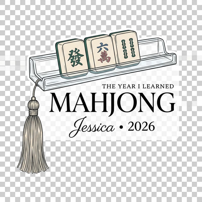
The Year I Learned Mahjong Ornament

THE YEAR I LEARNED MAHJONG Create ONE 2000 × 2000 transparent PNG containing exactly ONE personalized The Year I Learned Mahjong Christmas ornament artwork design. Flat printable artwork only — no physical ornament, hanging cord, mockup, hands, product photo, background scene, grid, production sheet, or multiple options. EXACT PERSONALIZATION Jessica • 2026 EXACT WORDING / HIERARCHY “THE YEAR I LEARNED” / “MAHJONG,” with MAHJONG as the dominant hero wording. Keep every name, number, date, year, statistic, address, country, and symbol exactly as written. PROVEN / MARKET-ALIGNED ORNAMENT CONCEPT FORMAT Use a horizontal MAHJONG TILE-RACK milestone format. Current personalized Mahjong ornaments are actively using rack-shaped ornaments, tile rows, names, and the year. Build an original flat-art interpretation around exactly THREE oversized tiles sitting on one rack, plus ONE substantial tassel. Use the successful HIGH-LEVEL ornament architecture only. Do not copy any seller’s exact artwork, border, illustration, lettering, or layout. COMPOSITION Place the three tiles across the upper third on a clear rack. Keep THE YEAR I LEARNED small and editorial near the rack edge. Make MAHJONG large beneath. Let the tassel descend from one end so it creates an asymmetrical collectible silhouette. Place Jessica • 2026 as a clean lower personalization line. Minimal filler only. Make the live artwork large and substantial, approximately 1700–1750 px within the 2000 × 2000 canvas, with balanced transparent padding and strong thumbnail readability. AESTHETIC Grandmillennial Mahjong / modern chinoiserie — grown-up, social, collectible, decorative but not fussy. TYPOGRAPHY — CRITICAL MAHJONG: high-contrast refined serif with elegant curves. THE YEAR I LEARNED: spaced small-cap serif. Jessica: graceful connected script. 2026: compact classic serif. Do not force the same font family across the collection. The typography must look native to this micro-niche. LINE / SHAPE TREATMENT Medium-thin hand-inked outlines with fine tile-face detail. No chunky black sticker outline. COLOR DIRECTION Deep Jade #356B5B, Chinoiserie Blue #52779A, Antique Rose #B77D88, Warm Ivory #F3E8D5. Typography may use solid color. Decorative artwork should stay clean and printable; keep interiors open/outline-led when that improves the niche style. PERSONALIZATION The personalization and year must be visually important, not tiny afterthoughts. Integrate them into the proven concept format whenever possible. AVOID No universal wreath-and-banner formula. No default giant crest. No random clip-art pile. No generic varsity look unless the niche truly calls for sport typography. No gradients, faux glitter, heavy shadows, glow, 3D, photorealism, watermark, extra wording, misspellings, or cropped artwork. Do not add a full floral wreath or oversized crest.