

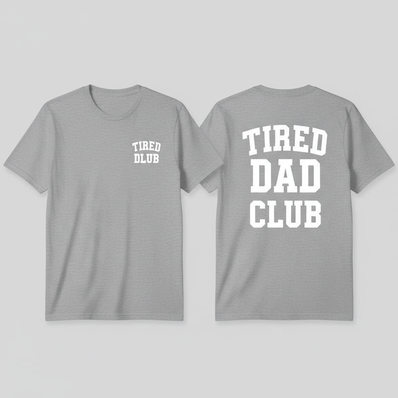
Tired Dad Club Varsity T-Shirt Design

Create a single t-shirt design with two placements: a small front design and a large back design, both reading "TIRED DAD CLUB". Single-color print (white, black, or grey lettering) so it works across different shirt colors. FRONT (left chest placement): Small, compact version of "TIRED DAD CLUB" — bold condensed varsity/athletic-style block lettering, arched slightly like a club crest, no background shape needed, just clean lettering sized to sit over the left pec like a small logo. BACK (large, centered): Bold condensed varsity/athletic block lettering, same font style as the front for consistency, stacked across 2-3 lines ("TIRED" / "DAD" / "CLUB" or "TIRED DAD" / "CLUB"), large enough to fill the upper-back area, clean and high-contrast, no extra graphics or icons — text only. Style notes: cool, bold "club" aesthetic like a varsity letterman crest or streetwear team logo — condensed, slightly aggressive block font, not script or handwritten. Flat print-ready artwork, no gradients, no busy background, shown as a front/back mockup on a plain colored t-shirt.