

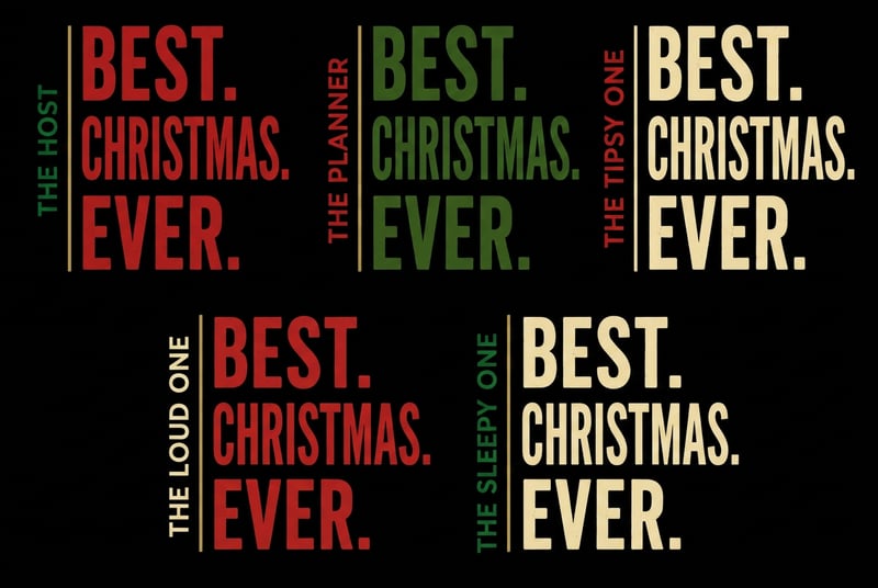
Coordinated Adult Christmas Typography

Use the supplied reference image only as the typography, composition and layout guide. Create exactly five coordinated adult Christmas typography designs arranged three across the top and two centered underneath. Every design must be freestanding typography with no colored rectangle, panel, box, badge, fill or individual background behind it. The black canvas is only a temporary preview surface and must remain visible between and around every design. Use the identical tall condensed font, dimensions, spacing and layout for all five designs: one small vertically rotated role on the far left, one thin antique-gold vertical divider immediately to its right and the exact stacked headline “BEST. CHRISTMAS. EVER.” immediately to the right of the divider. Design 1: “THE HOST,” with a rich Christmas-red headline and deep forest-green role lettering. Design 2: “THE PLANNER,” with a deep forest-green headline and rich Christmas-red role lettering. Design 3: “THE TIPSY ONE,” with a warm-ivory headline and rich Christmas-red role lettering. Design 4: “THE LOUD ONE,” with a rich Christmas-red headline and warm-ivory role lettering. Design 5: “THE SLEEPY ONE,” with a warm-ivory headline and deep forest-green role lettering. Change only the typography colors; never add colored backgrounds. Keep the role on the far left of every design as one continuous vertical line and never place it beside or underneath “EVER.” Keep all five designs identical in size, fully visible, evenly separated and uncropped. Spell every phrase exactly as written. Use only a subtle vintage ink texture while keeping the lettering bold and crisp. Isolated artwork only; no garments, products, people, icons, illustrations, photography, scenery, shadows, colored blocks, frames, watermark or additional wording.