

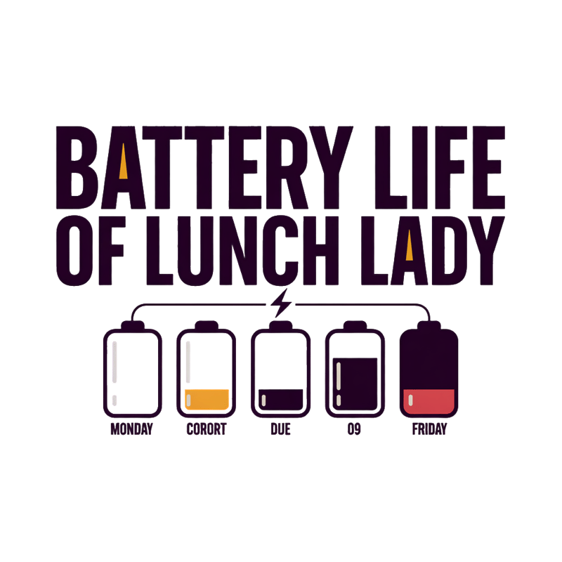
Lunch Lady Energy Cycle Typography

A bold, modern typographic design on a black background that humorously illustrates the weekly energy cycle of a lunch lady using a minimal, infographic-inspired layout. At the top, the phrase “BATTERY LIFE OF A LUNCH LADY” is set in confident, clean uppercase lettering, with subtle color emphasis on key words to add personality without clutter. The typography feels strong and friendly, avoiding cartoonish styles while staying approachable. Below the headline, a row of five simplified battery icons stretches horizontally across the design. Each battery is rendered in a flat, clean style with smooth outlines and solid fills, visually progressing from fully charged to nearly empty. The colors transition intentionally—from fresh green and yellow at the start of the week to warm orange and finally deep red—clearly communicating the gradual energy drain. Under the battery row, “Monday” appears beneath the first battery and “Friday” beneath the last, connected by a thin, playful line that subtly resembles a charging cable. A small lightning bolt or plug icon at the end reinforces the energy theme without overpowering the design. The overall layout is balanced, centered, and easy to read at a glance. The color palette is controlled and high-contrast, designed to pop on black apparel while remaining clean and professional. The style is modern, relatable, and lightly humorous, perfect for everyday wear, gifts, and workplace merch that feels clever and self-aware rather than loud or gimmicky.